The New Twitch Layout Is Slick, Clean, and a Huge Improvement
Updated Sept. 27 2019, 4:24 p.m. ET

Popular streaming service Twitch has been in operation for nearly 10 years, and it finally received an updated look. It's slick, clean, and even comes with a new font for better readability and an overall design overhaul. It's been a long time coming, but the new Twitch layout is here, and it's better than the site has ever looked before.
What all does the new layout feature? We've got it all laid out for you here so you can keep up with what's new and what's different.

What all does the new Twitch layout entail?
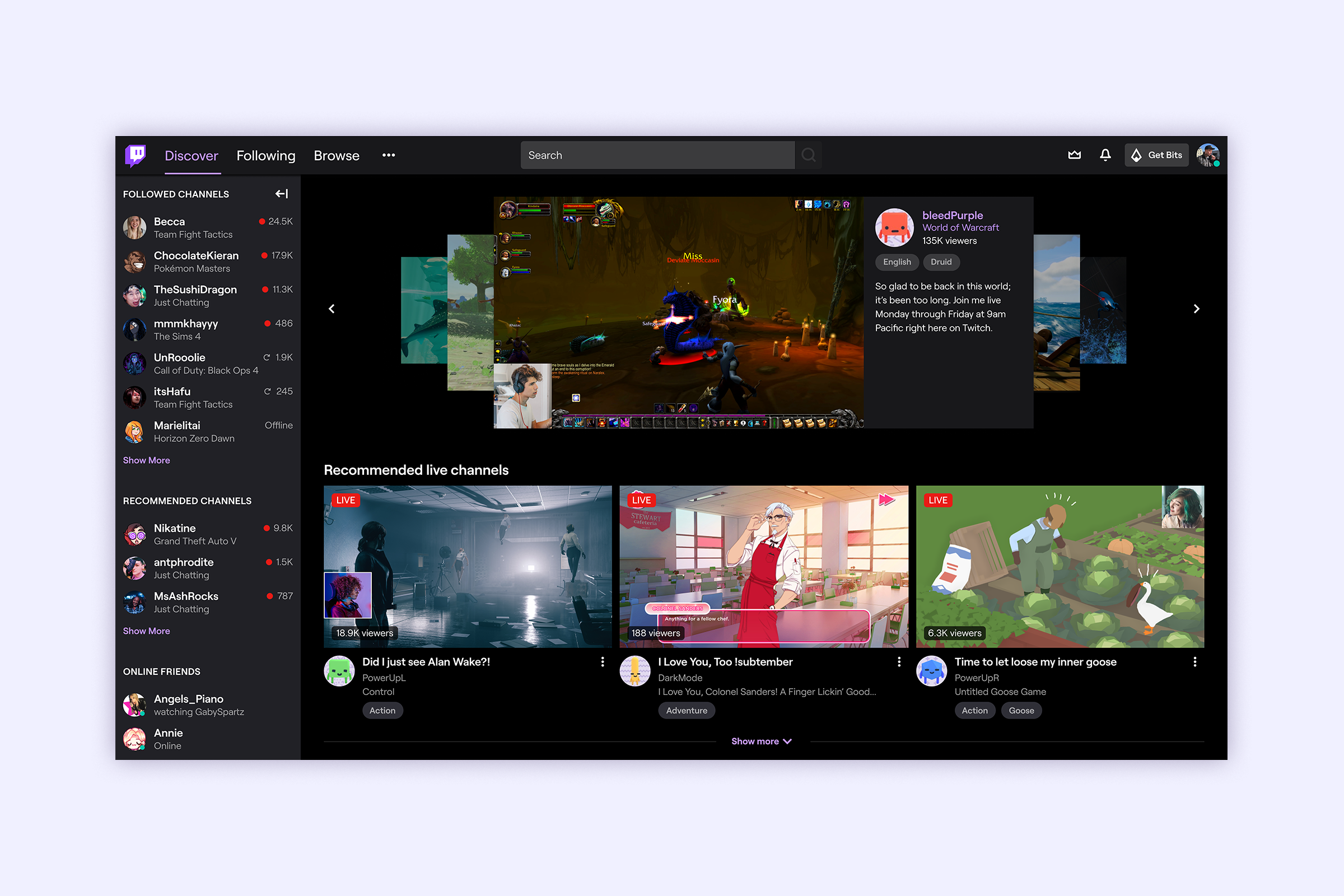
The site doesn't look totally different, as you'll see when you go to the main page, but it has been given a nicely fine-tuned upgrade. The goal, according to Twitch, was to "elevate every single person on Twitch." To achieve this, first and foremost the team utilized a new font called "Roobert," inspired by the Moog synthesizer.
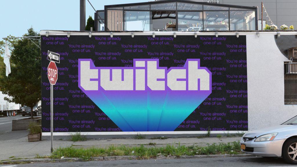
The new Twitch logo is pretty fresh, too.
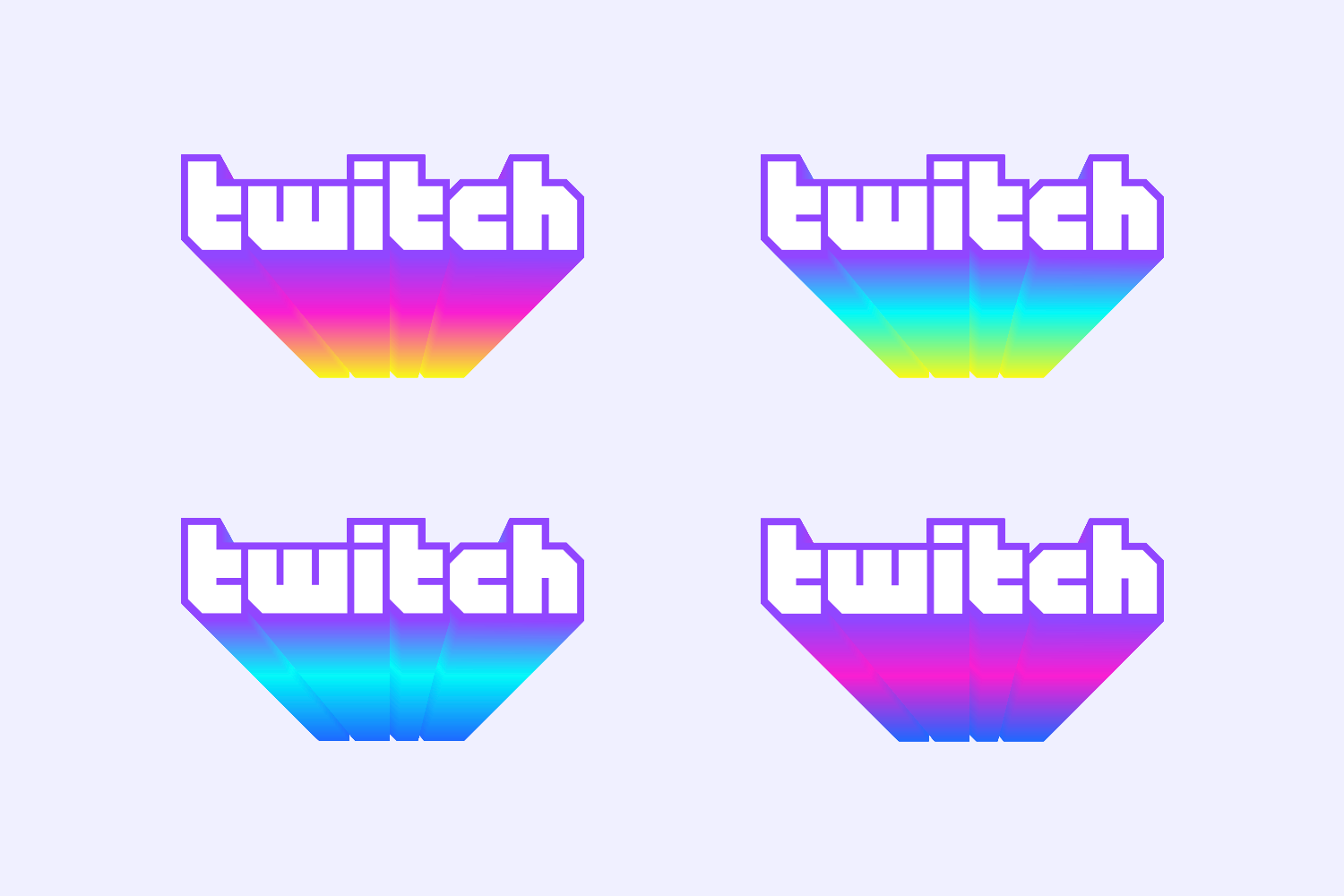
The classic Twitch logo also got a makeover to go with the overall redesign, though to look at it, you might not realize much has changed. The font is a bit different though. The logo is now one of the only places you'll see much of Twitch's iconic purple. The purple in the logo is a bit brighter now though, and showcased far better in the new logo than ever before, nearly neon this time around. It looks great, and is a good complement to the site layout.

There's a new emphasis on color, with a few dozen new colors that will be seen around the site instead of the dominant Twitch purple. There's also a new Creator Color tool, which will let content creators use a specific color on their page to better represent their brand and personality. The Dark Mode theme has also been given an aesthetic overhaul, too, so if you use that setting you're not going to be left out just because of all the pretty new colors.
Overall, the new look for Twitch is meant to help the service keep up with the times and offer additional tools to help those who use it regularly customize it to their liking. Otherwise, it's pretty much the same Twitch you know and love from over the years. Your subscriptions and followed channels remain on the left side of the page, and the streams on the right. There's still plenty of different creators to follow, and the entire site structure works in the same way.

Everything just looks a lot cooler now, with lots more color, modern fonts, and a revamped logo to keep everything looking nice and sharp, that's all. It remains to be seen whether Twitch will pursue any different redesigns in the future since this one was more on the minimal side, but we certainly wouldn't put it past them since the company is known for trying tons of different things with its users.