25 Clever Optical Illusion Logo Designs that Will Make You Go 'Whoa'
Updated Feb. 6 2020, 9:19 a.m. ET

A good logo can blow your mind. I am about to show you 25 pictures that prove that fact. It all started when Megan Fox posted the incredible design for The Swan and Mallard restaurant on Twitter.
It's such a good design that it prompted others to share impressive logos they love. And those inspired me to scour the internet for the cleverest optical illusion logos that will mess with your brain in the best way possible. Without further ado...
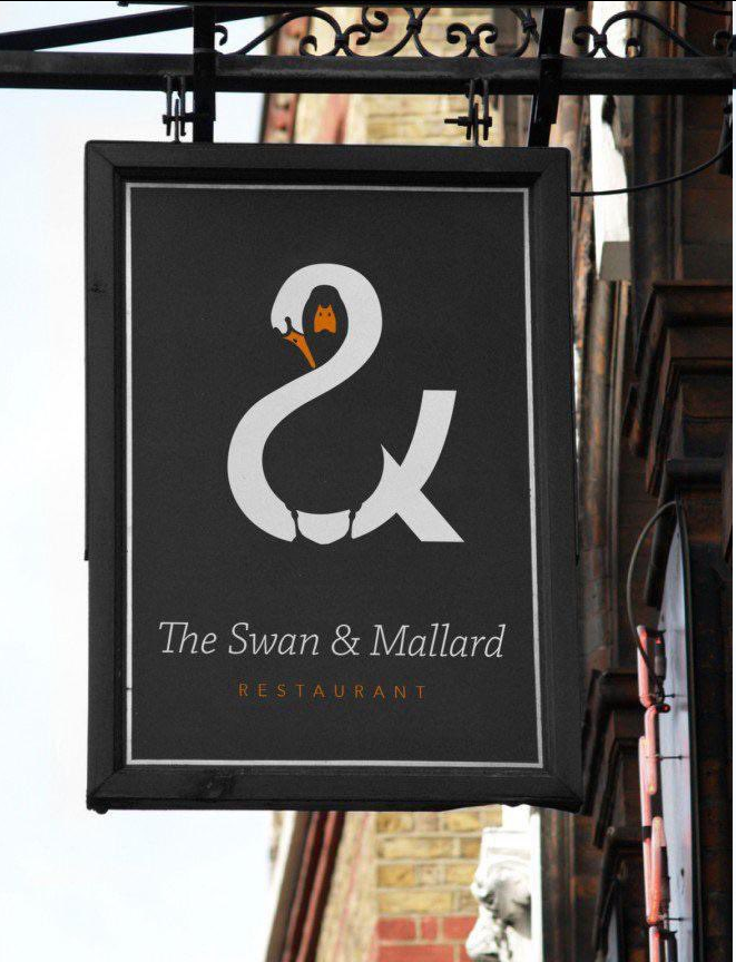
The swan as the ampersand is cool enough, but when you notice that there's a black mallard duck being hugged by the swan, it gets even better. It's so cute in addition to being super clever.
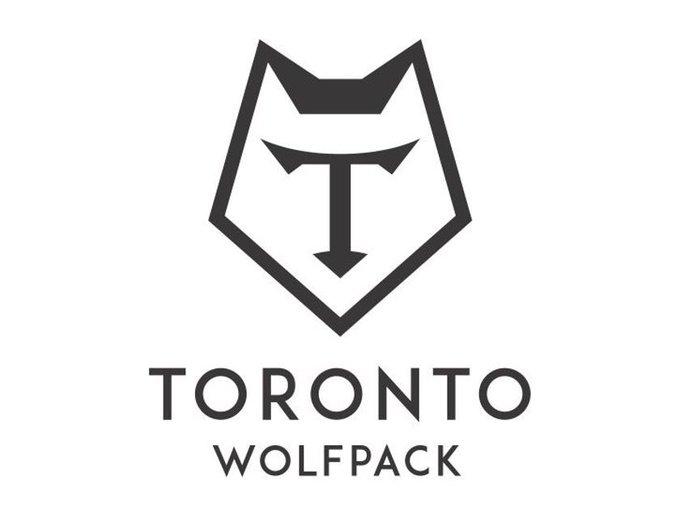
Love this because it's clearly a wolf head but it's also a powerful letter T for Toronto. These are the kinds of logos that make me think graphic designers have some sort of superpower.
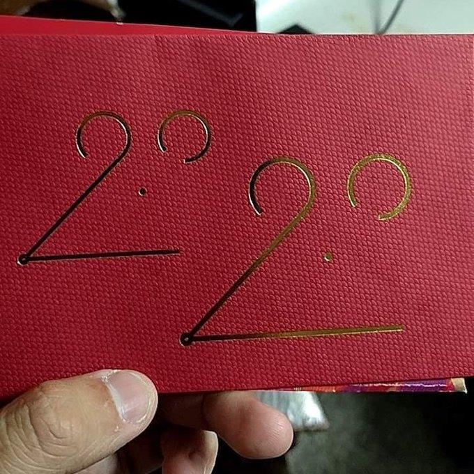
It's 2020, and 2020 is the Year of the Rat! This might be the cutest logo involving a rat that I have ever seen in my whole life. And this one has two rats! Their little noses are too much.
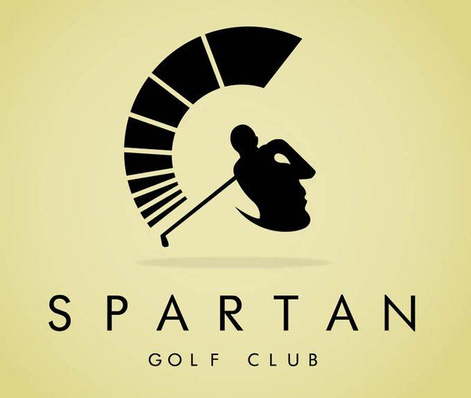
I cannot handle this logo. It's too perfect. It's a golfer! And a spartan! For the Spartan Golf Club! And both are so perfectly visible and stylish. This is a total masterpiece.
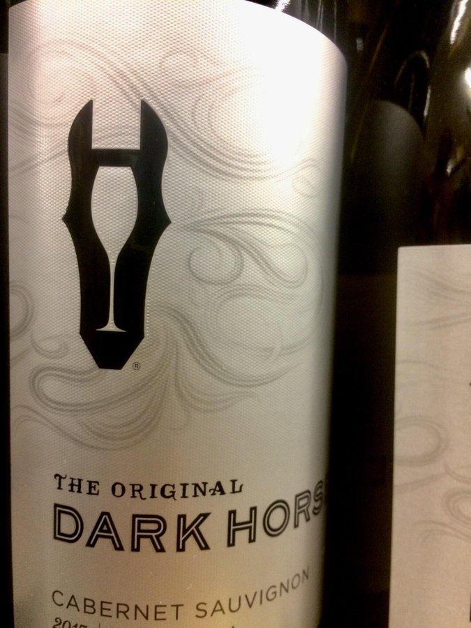
The way some people are able to use negative space so creatively is totally impressive and baffling. Not to mention, a glass of wine? Hidden in a horse's face? That's kind of the definition of classy.
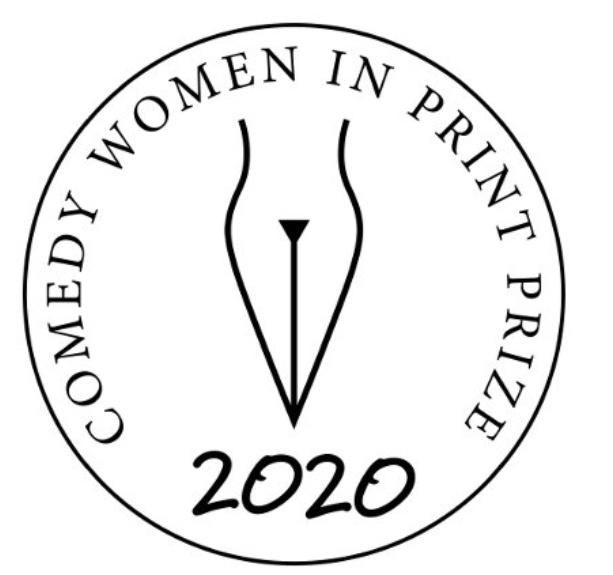
Ooh I love this logo so much. It looks like a woman's body but also the tip of a fountain pen, which makes total sense for a Prize for comedy writing women. Genius.
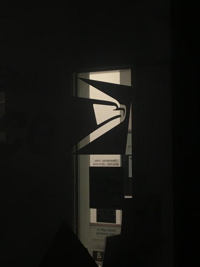
This one blew my mind. I've been looking at the USPS eagle logo for years not realizing that it also looks like a person putting a letter down a shoot. If you see the beak as the hand of a person and the rest of the head as a letter, you'll see it eventually.
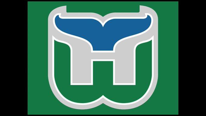
The Hartford Whalers logo is everything. It's an H; it's a W, and it's a whale's tale. I wish the ice hockey team still existed just so we'd have more occasion to look at this logo.
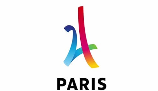
The 2024 Summer Olympics are set to take place in Paris, and even though it's four years away, they already have an amazing logo. It looks like a 24, but it's also in the shape of the iconic Eiffel Tower. Touché, Paris! (Get it? Because it's French!)
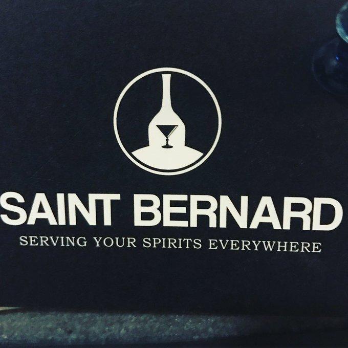
First of all, I love that the name of this liquor company is called Saint Bernard because that's a really adorable dog. Second of all, I love that their logo is a really cute dog face built out of a liquor bottle, a martini glass, and some cleverly-arranged negative space.
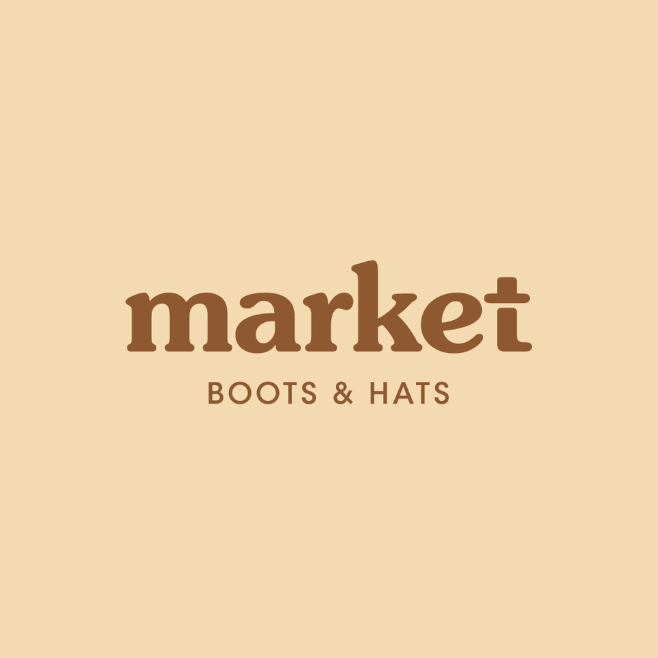
This logo makes me so mad because it's incredible. It's so simple. All they did was detach the top of the "t" from the rest of it, and now they have a hat and a boot. You know cute aggression, when you love something so much you want to squeeze it? That's how I feel about this logo.
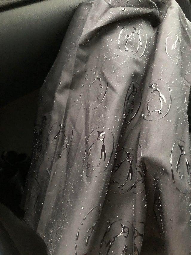
This logo is extra innovative! It might not be an optical illusion in and of itself, but the umbrella is designed in such a way that the logo only shows up when it gets wet. I believe the technical term for this is magic.
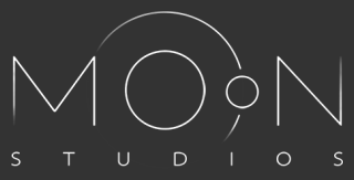
Moon Studios was smart enough to realize they had a moon and an Earth right there in the word "moon." So they went for it, but they did it in such a subtle, cool way that it works beautifully.
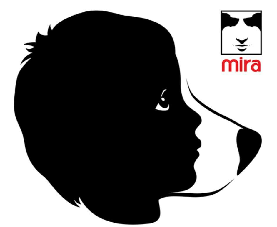
This is an ad campaign for Mira service dogs, and it makes me want to cry because I love it so much. You can see the child's face in the dog's, and then in the organization's logo itself, dogs make up the person's eyes! Man, dogs are the best.

Not only does this logo for The Climb look like a mountain, but it's actually made of letters that spell out "climb." When I saw this, it almost make me want to go mountain climbing. Almost.
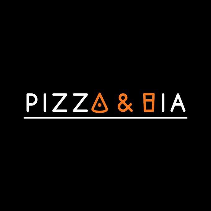
The person who posted this explains that "bia" means "beer" in Vietnamese, so that makes this simple word and image logo completely perfect. You can get it from the words or the slice of pizza and glass of beer in orange.
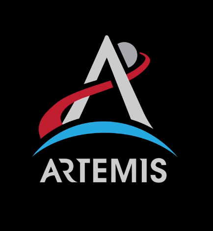
The logo for NASA's Artemis program is the letter A, but it also looks like a journey up to space from the surface of the Earth. If the people who are working on getting us to space are half as talented as the person who designed this logo, I think we'll be in good shape.
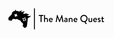
Yes, this logo is amazing because two horse heads make up the image of a video game controller. But more importantly, The Mane Quest is a website all about the horses in video games. And I just love that it exists.
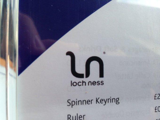
I never thought the letter "l" could look so cute, but here we are. The Loch Ness logo is just a simple lowercase "ln," but it looks just like a terrifying(ly cute) sea monster.
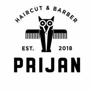
The comb and scissors make up an owl in this barber's awesome logo. What a hoot! (I am not sorry for this joke. I will not apologize for my puns.)
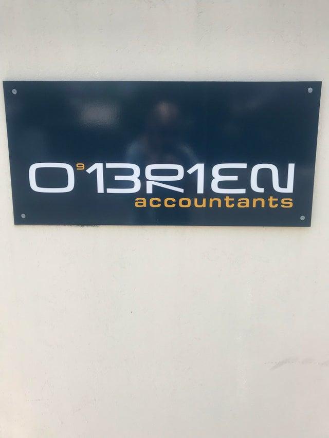
This is awesome. O'Brien's Accountants' logo is the phone number at which you can reach them. Wow, these accountants really have a way with numbers.

Books? Letters? Combined into an adorable library logo? This is just about everything I love. The logo is two books stacked, but it's also an E and a B for "Elihu Burritt." Love it!

The logo for this Jamaican restaurant is so playful and joyful! There's a chicken embedded in the face of the woman because jerk chicken is a signature dish in Jamaican cuisine. I totally want to eat here.
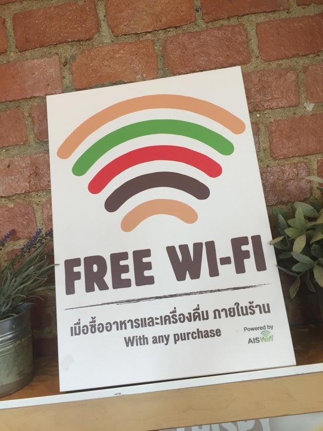
The wifi logo in this Burger King is a burger! It's amazing what you can do with color and color alone. Now, I want to go on the internet and I'm hungry.
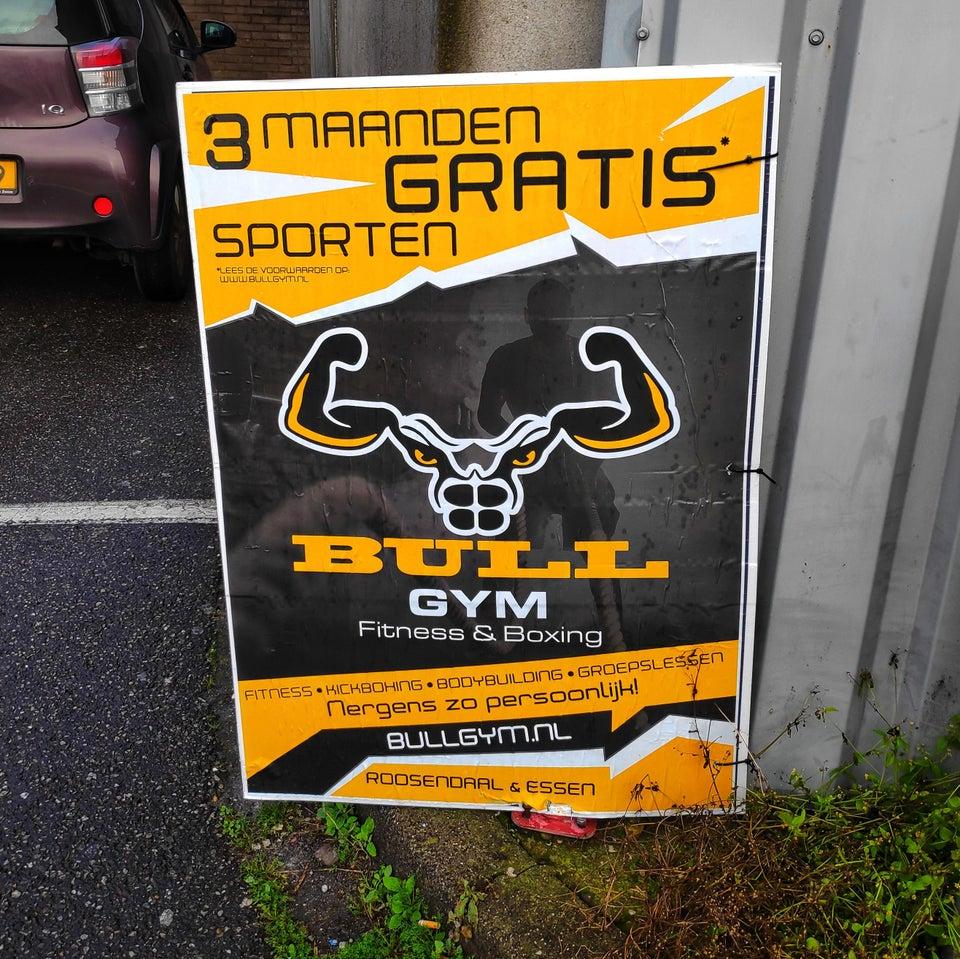
It's a little bit disturbing how well a bull's head can translate into a jacked dude's body. But it is very on brand and works very well with the image that Bull Gym is trying to convey.