Facebook Updated the Messenger Logo and Users Are Less Than Thrilled
Updated Oct. 16 2020, 5:24 p.m. ET
It seems like right when we start to get used to a new layout or scheme on our favorite social media app, the people behind the platform decide to switch things up. This is particularly accurate with Mark Zuckerberg and his team over at Facebook. The social media giant has gone through multiple changes and looks over the years.
Most recently, Facebook decided to switch up the colors on the logo to a more colorful look, with purple, pink, and orange at the forefront, on their chat feature, Messenger.
So, why is Facebook Messenger purple now?
Facebook says the reasoning behind adding some purple color to the long-standing white-and-blue Messenger logo is to reflect and signify a change in the app.
“Today, Messenger gets a new look to mark our continued evolution from a simple way to message your Facebook friends, to a place to hang out with your favorite people, on your favorite apps and devices,” Facebook said in a statement.
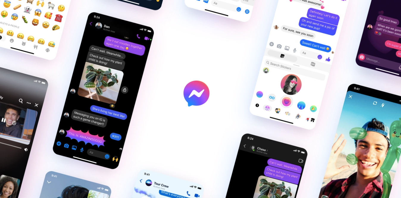
According to the tech company, the new logo "reflects a shift to the future of messaging, a more dynamic, fun, and integrated way to stay connected to the people you’re close to. We hope you like it as much as we do." So, do people actually like the change to the logo?
Users are mostly not on board with the new Facebook Messenger logo.
Since the app update went into effect, some Messenger users are not so keen on the change. One person felt that the phrase “if it ain’t broke, don’t fix it” fit perfectly when mentioning the new logo. “Really now Messenger? Why change your logo? The blue and white was just fine in itself!” they tweeted.
Another user mentioned that this logo change was Facebook’s sad attempt to stay hip and relevant. “So...Facebook messengers new logo looks like its trying to stay hip....I know I use messenger to keep in contact with the squad and a few mates, but come on! Should stick to the original logo! Next it will be Facebook trying to look young and colourful!” they wrote.
The Messenger logo isn’t the only thing that Facebook has updated recently.
Facebook pointed out in their announcement that it wasn’t just the Messenger logo that went through a makeover. In recent months, Facebook added a bunch of new features to Messenger, including Rooms, which gives users the ability to watch videos together with friends, and a more seamless Instagram integration.
“Over the past six months, we’ve been busy launching products and features that make it easier and more fun to be with your friends and family when you can’t be together in person, whether that’s popping into a virtual room to catch up, or watching funny videos together. You can even easily connect with many of your favorite small businesses, even if you can’t visit them IRL,” the platform wrote.