Why Did The Spotify Logo Change? The New Disco Ball Icon Has Fans Talking
Spotify’s classic green logo is not gone for good, even if the app briefly stepped into its disco era.
Published May 18 2026, 11:25 a.m. ET

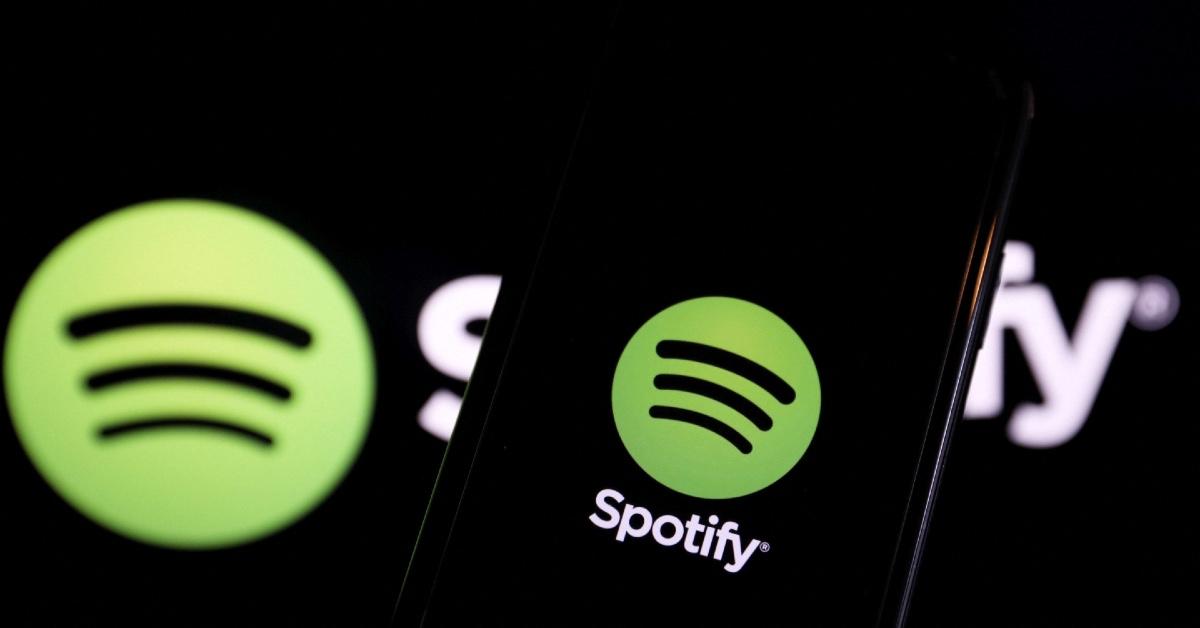
The Spotify app looks a little different these days, and some users are a bit confused. The music-streaming giant swapped its familiar flat green app icon for a shiny disco ball version on mobile. But before anyone starts mourning the classic logo, this change is not a permanent rebrand.
Spotify launched in October 2008 in Finland, France, Norway, Spain, Sweden, and the U.K. Daniel Ek and Martin Lorentzon founded the company in April 2006, and the platform later launched in the U.S. in July 2011. The original Spotify logo looked way more playful than the clean green circle fans know today. It featured a green rounded square, white uneven lettering, and three arched lines above the “O,” which represented sound.

Why did Spotify change its logo?
Spotify changed the icon as part of its 20th anniversary celebration. The company tied the shiny update to its new “Spotify 20: Your Party of the Year(s)” experience and said users would see “a special green disco ball version” of the logo on mobile for a limited time.
This latest disco-ball version changed because Spotify wanted to celebrate its 20-year milestone, not because the company wanted to ditch its classic identity. Spotify also used the anniversary moment to roll out a mobile-only feature that lets users look back at their full listening history, including their first streamed song, all-time top artist, and top 120 songs. The music streaming platform even joked about the mixed reaction online.
“Alright, we know glitter is not for everyone. Our temp glow up ends soon. Your regularly scheduled Spotify icon returns next week,” they wrote on X.
The company has also explained that its logo and design choices often change with culture. In an April Spotify newsroom interview, Lauren Solomon, Spotify’s senior director of global brand, said the company adapts its logo bug at will.
“At key moments, we adapt our logo bug and let it become an expression of culture. A great example of this is the past two years on Wrapped,” Lauren said. “Before launch, we released a set of logos adapted to reference some of the top artists, tracks, and albums of the year, teasing what’s to come.”
Spotify has changed a lot since it launched.
Spotify has made plenty of major changes in recent years beyond the logo. The company moved into podcasts, expanded into audiobooks, and launched features like DJ, daylist, Jam, music videos, and more personalized playlist tools. Spotify also changed its leadership structure. According to a press release, Daniel moved from CEO to executive chairman on Jan. 1, while Gustav Soderstrom and Alex Norstrom became co-CEOs.
Spotify also keeps growing, and it shows no signs of caving to competitors like Apple Music. Globally, Spotify appears more popular based on publicly reported numbers. In Q1 2026, Spotify reported 761 million monthly active users and 293 million Premium subscribers. Apple said Apple Music had its best year ever in 2025 for listenership and new subscribers, but Apple did not release a specific subscriber total in that update.