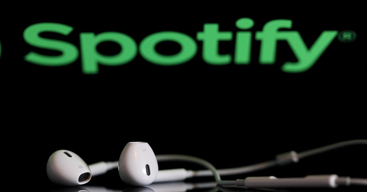
The Spotify Logo Is Now a Disco Ball — Users Are Divided Over the New Look
"It’s ugly but I like it. Everything is so perfectly sterile and over-considered lately."
Published May 15 2026, 9:30 a.m. ET

Spotify users recently opened the app and immediately noticed something looked different. The familiar green-and-black logo had suddenly transformed into a glittery green disco ball, leaving many people wondering if the streaming platform had quietly rebranded overnight.
Spotify’s temporary disco ball logo quickly became a topic of discussion across Reddit, Instagram, and X because of how different it looked from the platform’s usual branding.
Spotify disco ball logo is part of the app’s 20th anniversary campaign.
Thankfully for confused users, the disco ball logo is only temporary. Spotify updated the app icon as part of its 20th anniversary celebration and a larger campaign called “Spotify 20: Your Party of the Year(s).”
The company tied the shiny redesign to the campaign’s party theme rather than introducing a permanent rebrand. Spotify also launched a special in-app feature that lets users revisit milestones from throughout their listening history. Spotify even promoted the feature on Instagram with the message, “It’s our 20th birthday, but the gifts are for you. Join the party to rediscover your all-time listening history.”
People can reportedly see details including their first streamed song, their join date, total unique songs listened to, and their all-time top artist. The feature also creates an “All-Time Top Songs” playlist with roughly 120 tracks and individual play counts.
Spotify 20 feature gives users an all-time version of Spotify Wrapped.
Many users compared the anniversary feature to an expanded version of Spotify Wrapped because it focuses on listening habits collected across multiple years instead of just the previous one.
According to posts shared online, users can access the feature by searching “Spotify 20” or “Party of the Year(s)” directly inside the mobile app. Spotify also reportedly created anniversary pages highlighting major listening trends and milestones from the platform’s history.
While the feature itself received fairly positive reactions, the temporary logo redesign quickly became more divisive online. Some people praised the disco ball concept for feeling playful and less corporate than many modern app icons.
One Reddit user wrote, “It’s ugly but I like it. Everything is so perfectly sterile and over-considered lately.” Another user bluntly described the redesign as “horse s--t.”
Others joked that the icon looked more like a broken loading symbol than a celebration. One person said the logo looked like an app “mid-update,” while another compared it to “late 2000s Mountain Dew Gamer” aesthetics.
Still, many users agreed that the logo at least succeeded in getting attention online. Since the redesign is tied specifically to Spotify’s anniversary campaign, fans who dislike the disco ball likely will not have to stare at it permanently.