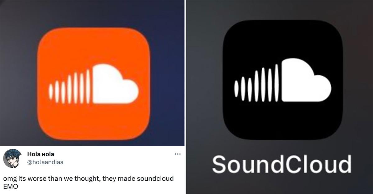
The SoundCloud Icon Turned Black and the Internet Is *NOT* Having It — Why Did the Color Change?
Published May 15 2023, 2:02 p.m. ET
The many apps and streaming services we use today absolutely do not look the same as when we first started using them in the first place. From their earliest days of launch to becoming widely-used staples of people's social media consumption, many of our favorite apps have adopted new looks or a minimalist aesthetic in order to appear edgier and more appealing to certain audiences. These changes can often produce mixed results.
If you've been using an app for long enough and it suddenly changes on you, those changes can be met with a fair amount of backlash from folks. No matter how big or small the changes are, people will notice and even formulate their own opinions on the change.
When you change something as prolific as a logo's color, however, that will most certainly raise some eyebrows. For instance, people have reported that the SoundCloud icon was changed to black. Where did this change come from?
Why is the SoundCloud black icon a thing now?
First launched in August 2007, SoundCloud is a music streaming service that allows anyone to upload and share their own audio files and songs. From professional musicians to your cousin trying to get their indie tracks off the ground, anyone can use the app to share music.
Most folks recognize the app as a little orange square with a titular cloud on it, or even just the little orange cloud. However, some users have noticed a significant change.
Many users have spotted the orange SoundCloud app icon having turned black instead. Though the change doesn't sound major, longtime users of the app are reacting poorly to this little change.
Now, folks have formulated theories on this. In a Reddit threat about the change, one person suggested that the creator might have died and the company changed the logo in solidarity or grief, though there is no official information on this theory.
By and large, however, not many people are a fan of the change.
@vietbrat on TikTok called the icon "too iconic to change" and demanded that they return it to orange. @mikevicxo felt as if "a part of [their] childhood just died" due to the color change. Many have called the new look SoundCloud's "emo" phase.
Though SoundCloud as a company hasn't made an official statement on the change, the official Twitter did put out a joke tweet about the new icon stating: "what do you think of my new look? I'm getting self-conscious."
The company itself has acknowledged people's thoughts on the change, even if they haven't actually explained why it's happened. If nothing else, the internet seems to finally agree on something: no one likes the new SoundCloud black logo.

