The Story Behind 15 Brands' Iconic Logos
Updated Aug. 3 2020, 3:56 p.m. ET
Ever wonder how the famous brands you interact with every day got their logos? The symbols and colors companies use to reflect their brand's values or the sentiments they hope to inspire in consumers are often the result of hours of consumer research, but sometimes, they're happy accidents.
Here are some of the fascinating origin stories behind iconic symbols of giants in industries from fast food to luxury fashion.
Starbucks
To get to the root of the Starbucks mermaid logo, you must first know the history of the company, which began as a coffee roaster in Seattle's Pike Place Market. The market's location on the waterfront definitely plays a role in the branding, but the truth is, the founders just liked names starting with an "St" sound. They landed on the name of the chief mate in Moby Dick and liked the sound of it.
They needed an appropriately maritime logo to go with the name and found an old woodcut of a two-tailed mermaid. She's undergone a few facelifts over the years and has gotten a bit more modest, but this siren is here to stay.
McDonald's
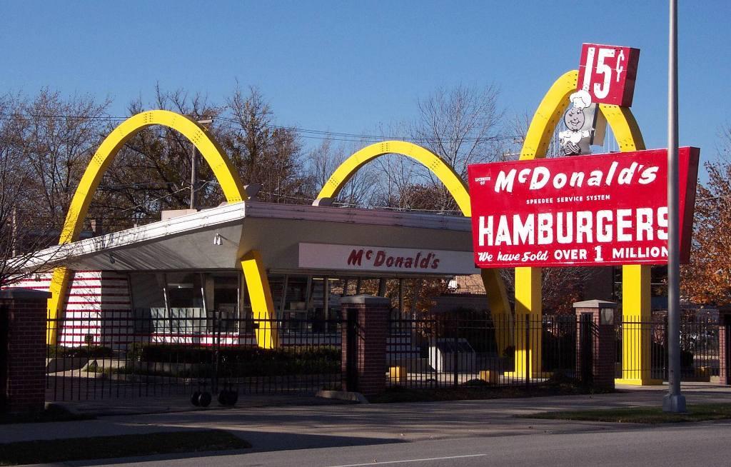
There are few logos more recognizable than the Golden Arches, which is even a nickname for the fast food chain. The bright hello double-arch originates from a remodel of the McDonald brothers' San Bernardino drive-in in the 1940s. Architect Stanley Clark Meston's design included an arch on either side of the restaurant and one holding their original sign, with a far less memorable logo. That drive-in remains today as a museum dedicated to the chain's history.
Mercedes-Benz
The luxury card brand used to be two separate car companies: Daimler and Benz & Cie. A few years before the merger, Daimler adopted the three-point star logo to represent his company's goal of dominating motorization over land, water, and sky.
Olympics
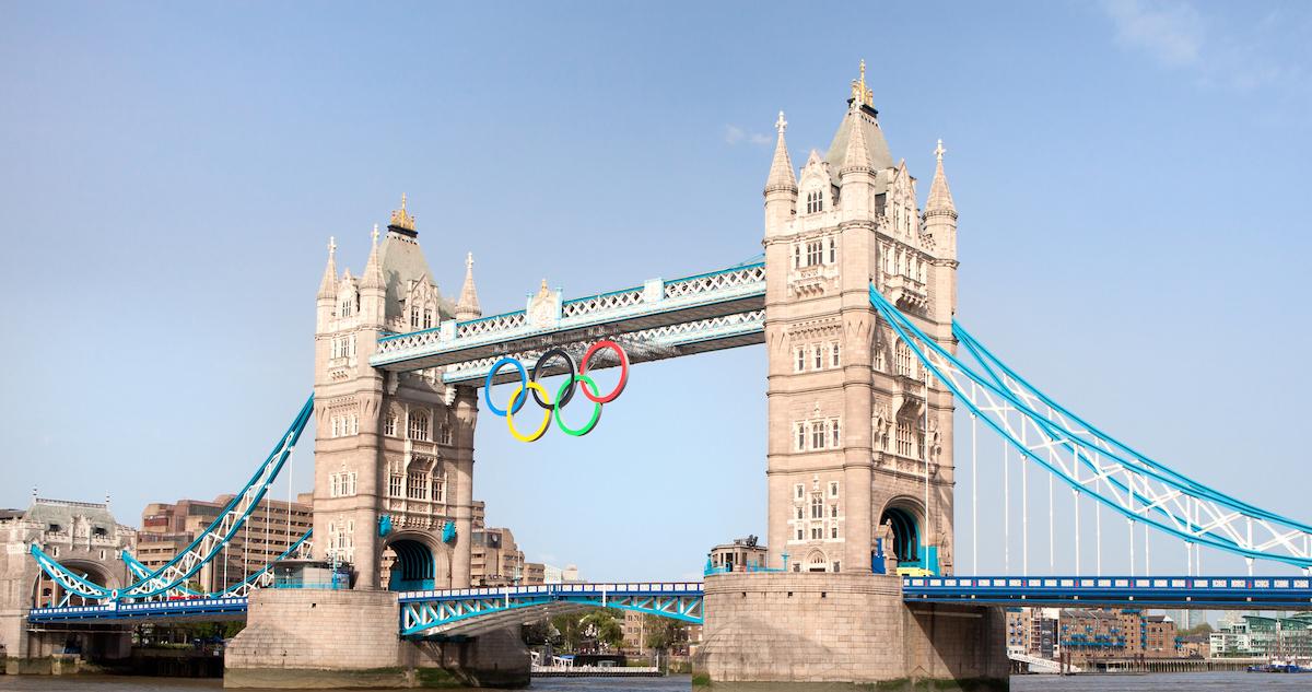
The five rings of the International Olympic Committee (IOC) represent five inhabited continents that participate in the games (Africa, The Americas, Asia, Europe, and Oceania), while the colors represent the colors of the participating nations' flags.
Apple
Steve Jobs named his company Apple because he was in the midst of a fruitarian fad diet around the time. During a visit to an apple farm, he decided a company called "Apple" would come across as "fun, spirited, and not intimidating" — three qualities he wanted people to associate with the then-novel concept of a personal computer.
The company's first logo had an illustration of Sir Isaac Newton sitting under an apple tree as he does in the apocryphal story about the inspiration for his theory of gravity. But this was quickly scrapped in favor or something sleeker: the now-iconic apple. As for why the apple has a bite out of it, it's mostly so people wouldn't confuse if with a cherry.
Lacoste
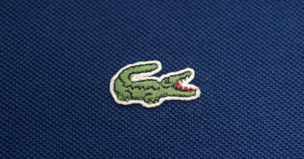
Ever wonder why the Lacoste logo is a crocodile? The clothing company began with knit shirts worn by French tennis player René Lacoste, who was nicknamed "the Crocodile." There are a couple origin stories for this monicker. One says it is a reference to his playing style, while the more popular theory is that it stems from a bet the player made over the outcome of a match, wherein the winner would get a suitcase made of crocodile (or alligator) leather.
Lacoste later cofounded a clothing company with André Gillier that made tennis (or polo) shirts with a crocodile embroidered on the chest — and the rest is history.
National Geographic
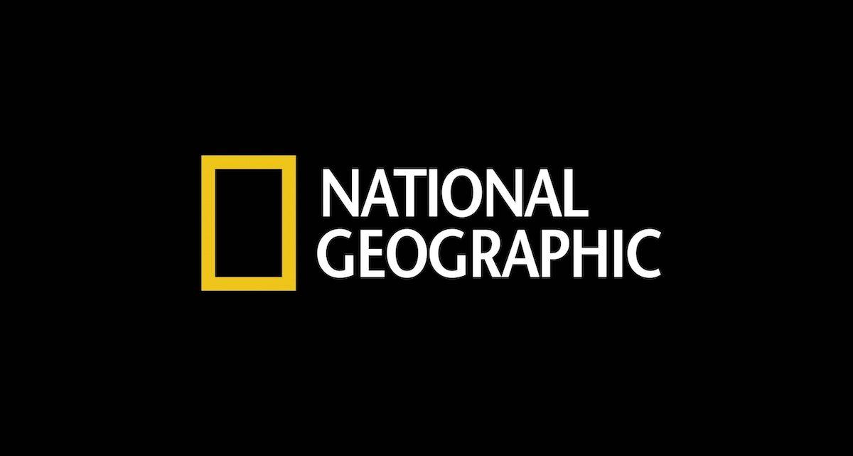
The bright yellow rectangle of National Geographic's modern logo represents the magazine's yellow border, which has been consistent throughout its 131-year history. It also symbolizes a photo frame and a "door or window to discovery."
Chupa Chups
If you were a fan of the Spice Girls in the late '90s, you've definitely sucked on a Chupa Chups lollipop or two. The Spanish candy company was founded in the 1950s and named after the Spanish verb chupar, which means "to suck." Makes sense! What's truly surreal is that the logo was created by artist Salvador Dali.
Nike
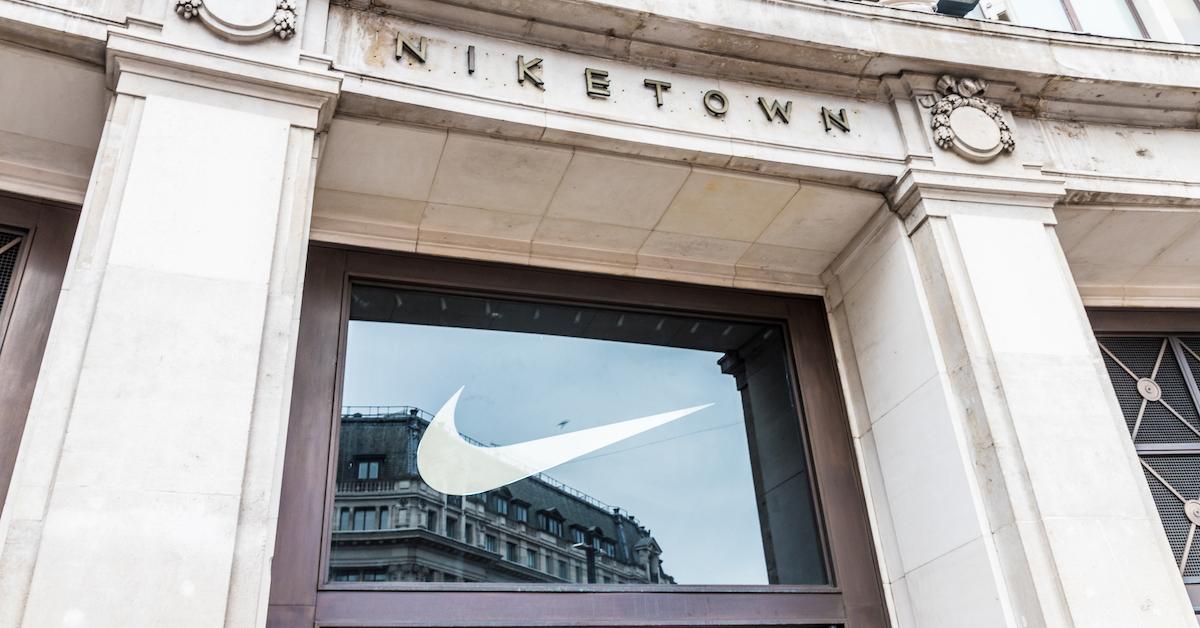
Imagine being the creator of one of the most recognizable logos in history. How much would you expect to be paid for that kind of branding work? In the case of Nike's logo designer the answer is... $35. Carolyn Davidson, a graphic design student at Portland State University, originated the "swoosh" in 1971 for a little company called Blue Ribbon Sports. The founder, Phil Knight, was an assistant professor at the university at the time.
For her services, Carolyn invoiced the professor a paltry $35 — the equivalent of about $220 today. Thankfully, she was rewarded with a decent amount of stock in the company, which was eventually renamed for the Greek goddess of victory, so her work ultimately paid off far beyond the 17.5 hours she originally billed for.
Tiffany & Co.
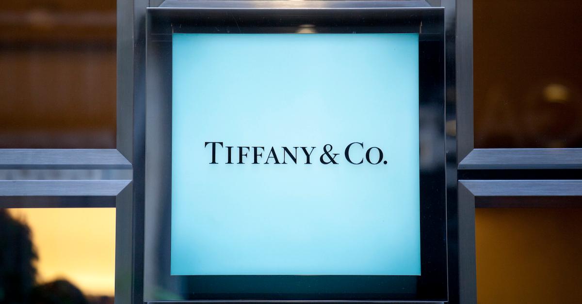
You know your brand is iconic when there's a color named after it. Co-founder Charles Lewis Tiffany chose the distinct robin's egg hue for the cover of his catalog in 1845. Eventually, the color was incorporated into the boxes and shopping bags, to the point where the Tiffany Blue Box has become a euphemism for a gift of expensive jewelry — especially diamond engagement rings.
Versace
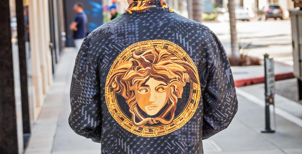
Gianni Versace's Medusa logo is based on the floor of ruins in Reggio Calabria, where he grew up. Aside from this nostalgic angle, Donatella Versace says the mythology behind Medusa was also a factor. Before being turned into a monster, Medusa had an irresistible beauty that made people fall in love with her forever, and Gianni wanted his brand to inspire the same loyalty and adoration in fashionistas.
Amazon
Jeff Bezos' multibillion-dollar company was originally called "Cadabra" — as in "abra cadabra" — but he astutely recognized this was way too close to the word "cadaver" and changed it. Why Amazon? Because it was "exotic" and the biggest river in the world, just as he hoped his company would eventually be the biggest book retailer in the world.
The original logo was pretty forgettable back when he sold only books and other media, but in 2000 they rolled out the logo you see on packages today. The arrow is not only meant to resemble a smile, which unconsciously inspires trust in the viewer, but it also leads from the "A" to the "Z" in the name, suggesting you can find everything from A to Z there.
Chanel
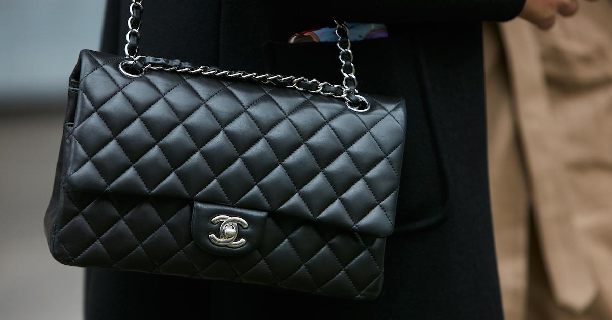
Obviously the interlocking Cs of the Chanel logo stand for the fashion house's founder, Coco Chanel. However, many believe it was inspired by one of two possible sources. The first is a monogram used by Catherine de Medici and her mother-in-law, Queen Claude of France. Another more likely origin is found in the stained-glass windows of Château de Crémat in Nice, France. The estate was owned by a friend of Coco's who gave her permission to mimic the vineyard's logo for her small fashion label.
Hermès
Hermès has been around for nearly 200 years — established during a time when people used horses and carriages to get around. However, the logo was actually adopted in the 1950s, well after cars became our common conveyance. The horse-and-buggy image is meant to evoke the luxury leather brand's humble origins. A century before they were hawking purses that cost five figures, Hermès fashioned horse saddles, harnesses, and bridles.
As for the orange color, this was born out of scarcity issues during World War II that made it impossible to continue making their original cream-and-gold boxes.
Chevrolet
There's some controversy about the origin of the Chevy logo, even within the company's official website. Co-founder William C. Durant said the symbol appeared on wallpaper in a French hotel he visited and it struck him that it would make a good nameplate for a car.
Durant's widow also thought a hotel stay inspired the "Chevrolet bowtie," but it was in the far more humble locale of Hot Springs, Virginia. She said they saw a similar design in a newspaper there and thought it would be the perfect emblem.
Durant's daughter Margery said the logo came out of a doodle her father made at the dinner table. And some historians think it's inspired by the cross on the Swiss flag — a nod to the birthplace of co-founder and namesake Louis Chevrolet.