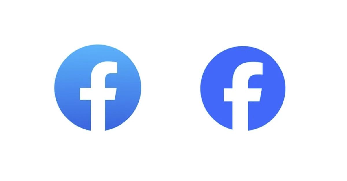
Facebook Changed the Blue in Their Logo, and People Are Starting to Notice
Published Sept. 27 2023, 10:35 a.m. ET

The Gist:
- Facebook updated its logo on Sept. 20, 2023, with a deeper blue and some small changes to the "f" in the logo.
- The changes were designed to make the logo more "electrifying" and "everlasting," but they definitely aren't major shifts.
- The company also made slight updates to its wordmark to align it with the new logo.
Although it may not be as popular with younger generations as it once was, Facebook remains the most widely used social media service on the planet. As such, Facebook has remained remarkably consistent over the years, doing very little rock the boat or change up its platform so that users feel uncomfortable or confused.
On Sept. 20, 2023, Facebook made a change that many people may have overlooked. Now, as they open the app or look at it on their browser, though, they have realized that something seems different. The blue in the logo seems different, and many people want to know why.

Did Facebook change their blue?
Facebook did make a slight update to its logo, and the blue in the logo is now a bit darker. Additionally, they made a few minor changes to the "f" that are almost imperceptible unless you know where they are.
Meta, the company behind Facebook, explained the change by saying that they wanted to make a new logo that seemed "everlasting."
"Our intention was to create a refreshed design of the Facebook logo that was bolder, electric, and everlasting," the company said in a blog post. "Each of the distinctive, new refinements drive greater harmony across the entire design as a key element of the app’s identity. We’ve done this by incorporating a more confident expression of Facebook’s core blue color that is built to be more visually accessible in our app and provides stronger contrast for the 'f' to stand apart."
The logo is certainly different, but it isn't a radical change, which makes sense. According to Meta's own statistics, Facebook is visited by a staggering 2 billion people every day, so a radical overhaul of the logo would likely cause a pretty significant disruption. They've updated the logo, but hopefully they haven't made it any harder for all of their regular users to find the app on their phones.
Facebook also updated its wordmark.
In addition to updating its signature logo, Facebook updated its wordmark with a new font and a blue to match the logo.
“Using our custom typeface, Facebook Sans, we redesigned the wordmark and logo to create a consistent treatment and improve overall legibility across Facebook,” Meta explained.
“Similar to the changes to the logo symbol, these refinements allowed us to build upon the heritage of our identity, while creating a stronger relationship between how the wordmark pairs with the rest of the typeface," the company continued.
Facebook did change its blue, but apparently, the company is hoping that this new blue will last forever. Check back on that in five years.