Instagram Has Made Its Logo Brighter, and Some Users are Less Than Thrilled
Published May 18 2022, 12:54 p.m. ET

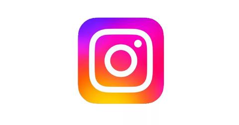
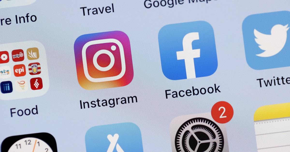
In a world filled with people who are addicted to social media, even minor changes aren't going to go unnoticed. Instagram recently unveiled a new logo, but this new logo was only a tiny change from what the logo used to look like. Instagram made the logo slightly brighter, but when that logo sits on the homepage of tens of millions of phone screens around the world, it's safe to say that someone is going to notice.
Instagram changed its logo to make it brighter.
The only change in the logo was an increase in its brightness. The logo definitely pops more, but Instagram hasn't released any official explanation for why they made the change.
It's possible that they didn't expect anyone to notice, but if that's what they thought, they were dead wrong. Plenty of Instagram users noticed, and many of them weren't happy about the shifting colors.

Instagram users want their old logo back.
In posts on social media, users have complained about the shifting logo, with some saying that they'll have to adjust the brightness on their phones to keep it from blinding them.
"New Instagram icon is way over-saturated. Gross," one person wrote on Twitter.
In addition to complaints, some users have posted screen recordings in which their iOS seems to struggle with the new logo.
In the videos, the logo seems to toggle between the duller and brighter versions.
Some have also pointed out that this version of Instagram's logo, which was originally introduced in 2016, seemed incredibly vibrant at the time. Now, the logo has gotten even brighter. If the trend continues, it will just be a white box of blinding light in a few years.
Brands get new logos all the time.
Instagram's logo evolution is hardly the most egregious example of a company rebrand we've seen in recent years. In fact, Instagram's parent company recently debuted Meta, a corporate brand that seems explicitly designed to make people forget about all the terrible headlines that Facebook was getting.
Instagram's vibrant logo is very much in line with Meta's aesthetic. Whether that's a good thing or not is for individual users to decide.
As so often happens when a new design element is introduced, most people protest at first. That's true not just of changes to logos, but also of changes in the design of social media platforms themselves. When a new layout is introduced on Twitter, or a new feature is added on TikTok, there's often some grumbling about how this feature changes the experience and may even ruin it completely.
Ultimately, though, most people get used to the change and then move on from it. You may hear plenty of people griping about the newer, brighter colors on Instagram right now, and find some other change worth complaining about. Change can be hard, but most people find that they get used to it after a while. Social media companies make plenty of decisions that are out of our control, and all we can do is learn to live with them or leave altogether.