Why Did the Broncos Change Their Logo? Why Fans Still Miss the Classic "D"
Decades later, fans are still split on which Broncos identity feels like home.
Published Nov. 7 2025, 1:20 p.m. ET

If you’ve noticed that fans of the Denver Broncos light up every time the classic “D” logo makes an appearance, you’re not imagining it. From throwback jerseys in the stands to comments flooding social media, that retro look still holds serious weight.
So, it’s fair to ask: Why did the Broncos change their logo in the first place? More importantly, what’s stopping the NFL team from switching back? Unfortunately, the answer isn’t as simple as a style change. The decision to change their logo was a mixture of timing, branding, and tradition.

Why did the Broncos change their logo in the first place?
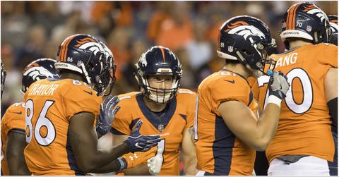
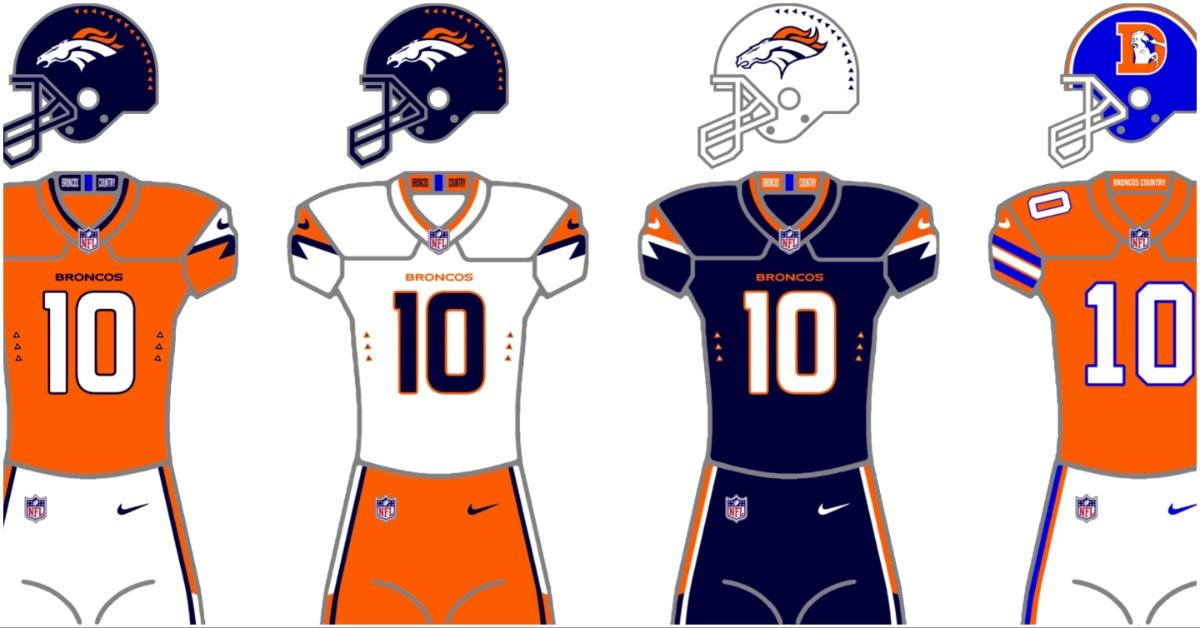
The Denver Broncos introduced their current logo in 1997 as part of a sweeping rebrand designed to modernize the team’s look heading into a new era. The old “D” logo — with a snorting horse bursting through the letter — had become a beloved visual, but by the mid-1990s, it was seen by many inside the organization as outdated. The team also swapped royal blue for navy and added sleek new uniforms.
Rick Bakas, the designer behind the updated look, shared insight into the design process in his portfolio. It began with a deep dive into the history and symbolism of the Broncos, including a Native American legend of a ghost horse that couldn’t be tamed. Early sketches even explored serpent and wave-like elements before the team settled on the now-iconic forward-facing stallion.
The orange in the design was intentional, too. “Orange represents the fiery belly of the stallion,” He explained. “That’s why the eyes ended up becoming orange — they're the windows to his soul.”
It wasn’t just a cosmetic shift — it was a statement of intent, and that era of change worked. Under the new logo, Denver won back-to-back Super Bowls in 1997 and 1998. According to Inconspicuous Consumption, many forever connected the new branding to those championship wins.
So, why do some NFL fans still want the old logo to return?
Still, nostalgia runs deep among NFL fans. Just look at social media any time the Broncos wear their throwback uniforms. “It was glorious to see the classic Broncos font and logo on the field,” one fan wrote on Reddit after attending a game. “Fans wearing the classic ‘D’ far outnumbered the fans wearing the new logo.”
That sentiment isn’t rare, especially among long-time fans. Some argue the old look is simply more iconic and visible on screen. “There’s a reason so many teams had solid colors with stripes,” one Reddit commenter said. “It’s really hard to see detail — like the dumb sleeve mountains — on TV from a distance.”
For others, it’s purely emotional. “The ‘D’ logo is the best and you can’t change my mind,” one user posted, echoing hundreds of similar comments. “Started watching right before they switched. I love both for what they are,” another said. “But I wouldn't want the ‘D’ as the primary. It has its heritage in the past.”
Throwback days often trigger this emotional divide among fans. Younger fans may prefer the sleek modern logo tied to Super Bowl wins. Older fans, on the other hand, connect the classic design with the grit of the Orange Crush era.
Changing the logo was not just about branding.
At the end of the day, the Broncos changed their logo for reasons that went far beyond rebranding. It was about identity — how a team wants to be seen, how fans want to feel, and how much history should factor into the future.
Some fans are hoping for another rebrand in the coming years — maybe something that nods to the past while embracing a fresh, updated look. Others are happy to keep the stallion as the face of the franchise. And many just want to see wins, no matter what the logo looks like.
Whether you love the bold, charging horse or hold onto that iconic “D,” one thing is clear: the visual identity of the Broncos is more than a design. It is part of what makes this team one of the most passionately followed in the league.