Here's the Real Reason Why the Orlando Magic Changed Its Iconic Logo
The NBA team also revealed three new uniforms.
Published June 3 2025, 5:27 p.m. ET

Professional sports teams are no stranger to making changes and updates to usher in new eras, and the NBA’s Orlando Magic is no exception, as the team recently unveiled a brand new logo to get fans ready for what’s to come.
Founded in 1989, the Orlando Magic has boasted some big NBA names on its roster, including Grant Hill, Shaquille O’Neal, Penny Hardaway, Vince Carter, Dwight Howard, and Tracy McGrady.
Why did the Orlando Magic logo change?
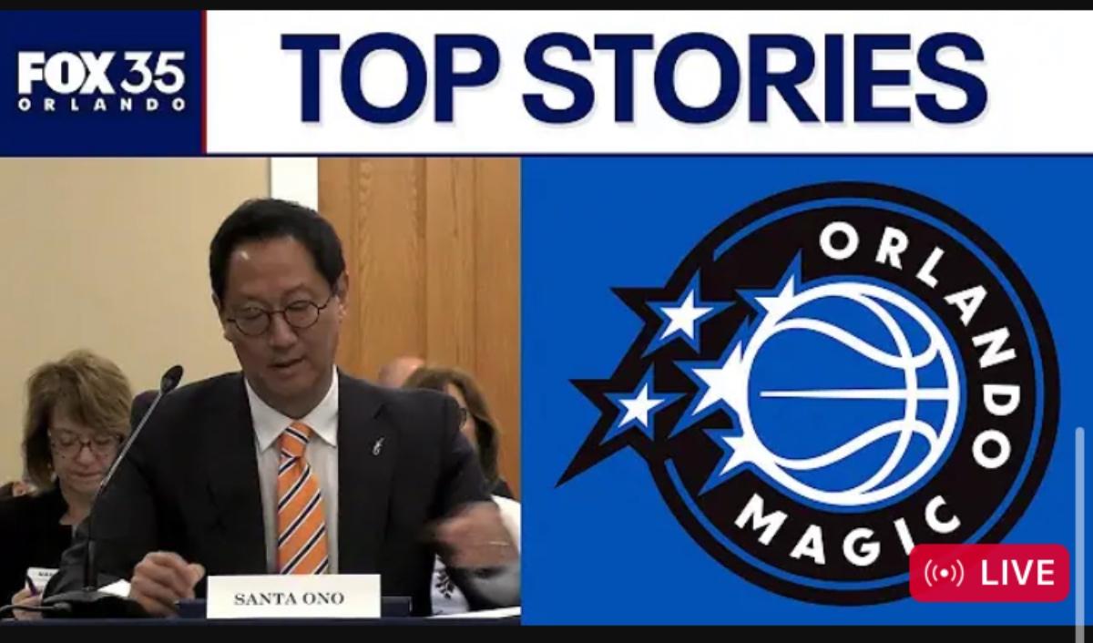
In an official media release on Tuesday, June 3, the Orlando Magic announced that its team logo was undergoing a change as a way to rebrand. “As the Orlando Magic continue to propel forward, the team unveiled a new logo and three new uniforms during a special celebration today at the Kia Center,” the statement began.
“With the team and Magic brand continuing to grow, the new logo fondly revisits the Magic’s history, making an iconic and fan-favorite franchise symbol, 'the star', once again,” the statement continued. “The logo evolves with a nod towards nostalgia featuring a legendary, star-centric logo displaying a “reach for the stars” mentality to match the team’s championship ideals.”
Orlando Magic executive vice president of marketing and social responsibility, Shelly Wilkes, offered additional insight into the decision.
“The Orlando Magic’s mission is to be world champions on and off the court. The logo and uniforms are an extension of that mission and a direct reflection of the excellence our organization strives for from our ownership to our staff, coaches and players,” she said.
“Based on fan feedback, the new logo was a collaboration and really a labor of love keeping in mind the affinity our fans have for our brand identity,” Shelly continued. “This logo and new uniforms signify the beginning of a new era of excellence for the Magic while paying homage to the past. We are excited to build upon our rich history with a modernized version of the uniform and logo that our fan base cherishes.”
What are the details about the new logo and uniforms?
Additionally, in the media release, the Magic elaborated on why the new logo was chosen and its history with the team.
“The logos incorporate the stars in multiple ways,” the team said. “It also stays true to the team’s roots continuing with the colors of Magic blue, Magic black, and Magic silver. The updated look includes the team’s secondary logo with the iconic star behind the ball appearing in motion, reflecting the team propelling forward and building on the heritage and history of the Magic from its birth in 1989.”
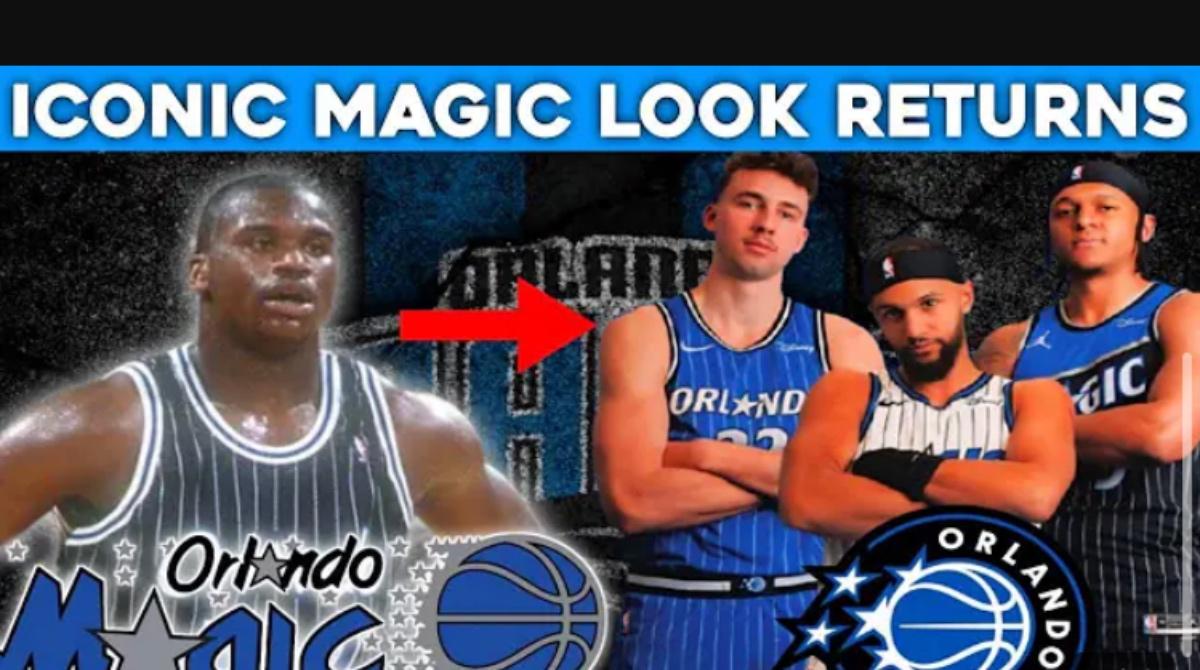
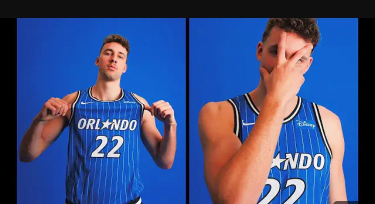
“The three new uniforms, Association (white), Icon (blue) and Statement (black) have evolved, honoring the rich history of the Magic’s most iconic jerseys while ushering in a new era of Orlando Magic basketball,” the statement said of the updated uniforms.
“With the return of the bold pinstripes, the MAGIC and ORLANDO wordmarks, uniform trim and bold star on the shorts of the Association and Icon editions, the uniforms are a nostalgic tribute to a favorite of the Magic’s fanbase while being on trend with current and future style,” the Magic added.
"The Statement uniform, the only Jordan brand uniform in the lineup, is influenced by the Orlando Magic’s original on-court warm-up jackets with bold pinstripes and the new star-centric icon featured on the shorts."


