YouTube Rolled out New UI — Users Wonder: Why Did They Change What Wasn’t Broken
YouTube didn’t fix a problem. It created one. Now, users are scrambling to relearn what wasn’t broken to begin with.
Published Oct. 15 2025, 11:13 a.m. ET

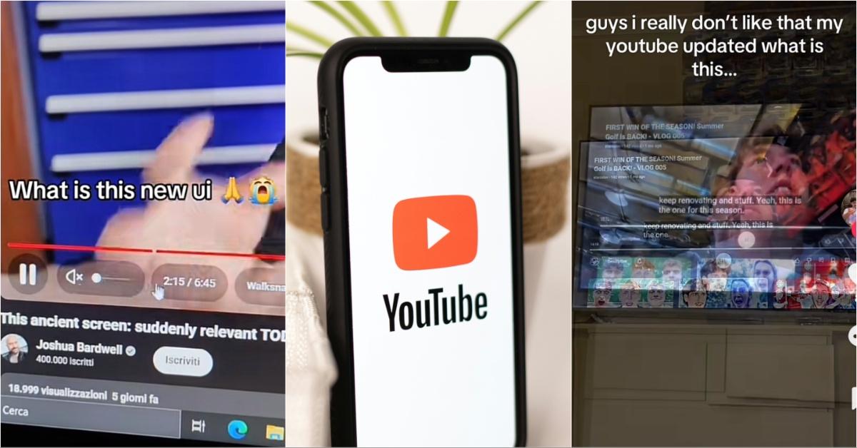
You open YouTube, ready to catch up on your favorite creators. You know the platform so well that you can probably navigate it with your eyes closed. Unfortunately, something doesn’t feel right. The buttons are bigger. Things that are usually instantly available are hidden in new corners. The platform isn’t exactly broken, but it doesn’t feel right either. In fact, it feels a little like someone came into your home while you weren’t there and moved your furniture around.
Following an update in October 2025, this feeling of dread was something all YouTube users started to feel. It resulted in everyone asking the same question: Why did YouTube change the UI of the platform when nothing was wrong with it?
Why did YouTube change the UI when the platform already worked just fine?
On Oct. 14, 2025, YouTube quietly dropped an announcement saying it was rolling out a batch of visual and interactive updates designed to make the platform “more engaging” and “easier to navigate,” according to Google’s official statement. If you experienced these updates and found yourself cursing whoever designed them, you aren’t the only one.
The update included a revamped video player with translucent controls, rounded buttons, and new icons. The skip feature (you know, that double-tap to jump 10 seconds) was redesigned to be “less intrusive.” On mobile, there’s fancier animation when switching tabs. It is the kind of thing that looks smooth during a demo but might make you dizzy when you’re just trying to find the comments section.
YouTube also added animated “Custom Likes” that match the vibe of the video — think confetti or musical notes when you smash the Like button. They reworked how you save videos to playlists. Spoiler: It’s more complicated now. Instead of one click to add a video to multiple lists, you must reopen the menu each time.
Finally, they added threaded comments. Most users, however, seem to agree this might be the only aspect of the update that isn’t horrible.
So, what’s the deal? Why fix something that wasn’t broken? According to YouTube, this redesign is meant to “reflect the energy of creators” and offer a more consistent experience across mobile, desktop, and TV. But to regular users? It feels more like a UI experiment nobody asked for.
The reactions to the UI changes speak volumes, and most of them aren’t pretty.
Scroll through Reddit, YouTube comments, or tech forums and you’ll see it fast: People are mad. Not mildly annoyed. Not slightly confused. They’re fired up.
- “Yeah but it totally sucks. ONE STAR.”
- “Why do they have to change something that worked flawlessly?”
- “It just looks ... cartoonish. Like it was made for mobile and blown up for desktop.”
And that’s just the polite stuff.
One Reddit user summed it up perfectly (and aggressively): “They do this every 2–3 years. They take a perfectly functional UI, turn it into a clusterf--k ... Then once you finally start to get used to it, they ref--kulate the entire thing into an even bigger piece of s--t.”
Beyond the harsh language, there’s a clear theme here — frustration mixed with fatigue. Users feel like they’re constantly relearning how to use a platform they’ve already mastered. And the changes? They don’t feel like upgrades. They feel like downgrades wearing a fresh coat of paint.
Some users even offered problems YouTube and Google could work on fixing, versus fixing something that was never broken: “If they wanted to fix something, let us organize the channels we subscribe to — folders would be great. Or at least let us see the name of a deleted video in a playlist so we can find it again if it's reuploaded.”
The point is, people aren’t against change. They’re against unnecessary change. Especially when it breaks things that worked perfectly well before. Furthermore, users are convinced these changes were far more about aesthetics than functionality.