Some Men Think About the Roman Empire — Marco Rubio Is Obsessed With Times New Roman Font
"This formatting standard aligns with the President’s One Voice for America’s Foreign Relations directive."
Published Dec. 10 2025, 3:50 p.m. ET

You might ask yourself, what's in a font? If you're wondering what kind of person is focused on font choice, the answer is: a lot of people. The great font debate ebbs and flows, though most people agree the least attractive one is definitely Comic Sans. It's important to pick a font based on the message you want to convey. For example, if you were sending out invitations for an elegant event, you might go with Garamond. It's classy without being desperate.
Nowadays, we can choose what kinds of fonts we want in all manner of media. From text over Instagram Stories to designing your own t-shirts, the written word is your oyster. Sometimes a font can do more than tell a story. In 2012, the use of Calibri helped solve a slew of forgery crimes in Turkey. That would make Calibri a bit of a hero, unless you're Secretary of State Marco Rubio. He just demanded the State Department switch from Calibri to Times New Roman. Here's why.
If you work for the State Department, you must use Times New Roman font.
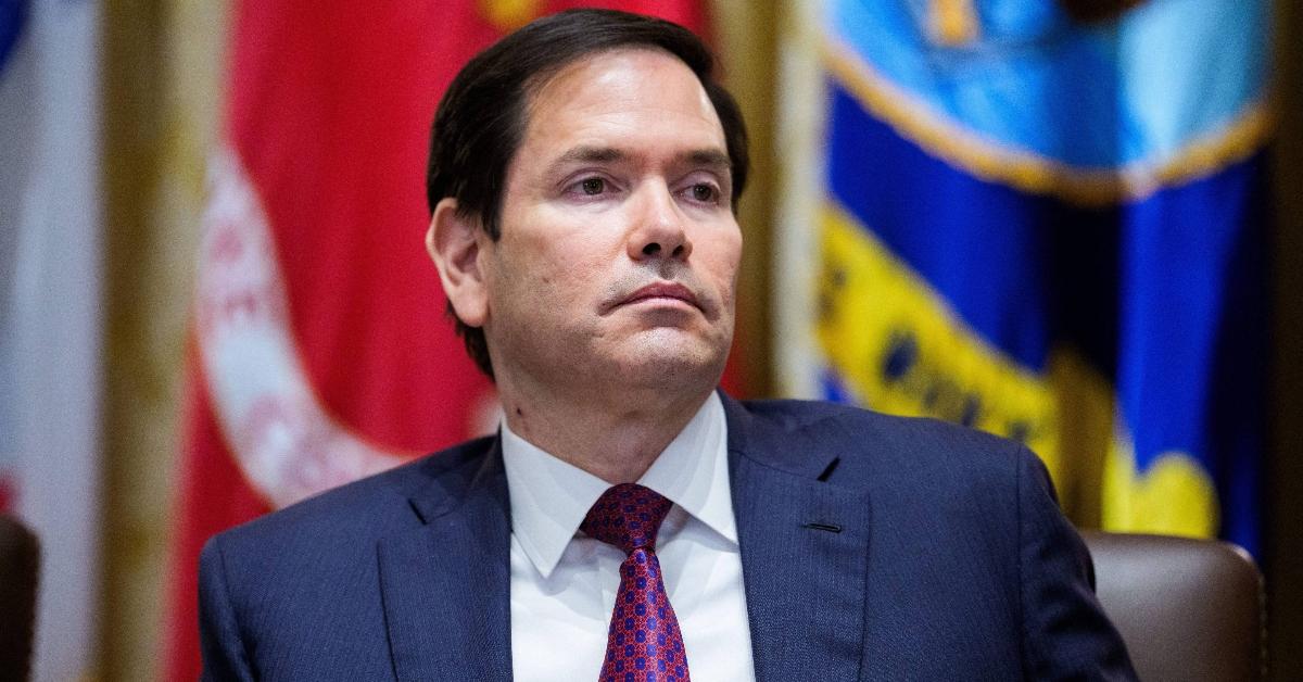
Even though Rubio is Secretary of State, acting national security adviser, and acting archivist of the United States, he somehow found the time to hyper-focus on what fonts were being used in State Department communications. In an "Action Request" memo obtained by The New York Times, Rubio said returning to the use of Times New Roman would "restore decorum and professionalism to the department’s written work."
According to NBC News, the memo was titled "Return to Tradition," which references the fact that Times New Roman was used from 2004 to 2023 when the Biden administration made the switch to Calibri. The difference between these two fonts can be found in the edges of the letters. Because Times New Roman is a serif font, there are small strokes on the ends of the letters. Rubio argued that the move to Calibri was part of the Biden-era DEIA push.
A spokesperson for the State Department told NBC News that, "Serif typefaces remain the standard in courts, legislatures, and across federal agencies where the permanence and authority of the written record are paramount." They continued, "This formatting standard aligns with the President’s One Voice for America’s Foreign Relations directive, underscoring the Department’s responsibility to present a unified, professional voice in all communications."
What's the deal with Times New Roman?
Although Times New Roman sounds like it should be a centuries-old font, it was actually first used in 1932, per the New York Public Library. It all began with a disgruntled type designer named Stanley Morison who felt The Times in London was "out of touch" with modern trends. The outlet challenged Stanley to create a new font, so he did.
Stanley focused on maximizing space and making the font as legible as possible. To do this, he partnered with draftsman Victor Lardent. He was inspired by classical fonts like Gros Cicero, which first popped up in the 16th century. Times New Roman made its debut in The Times on Oct. 3, 1932, and was well-received. The first time it was used in America was in December 1941, in the Woman’s Home Companion magazine.