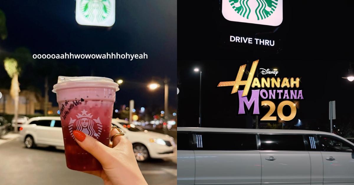
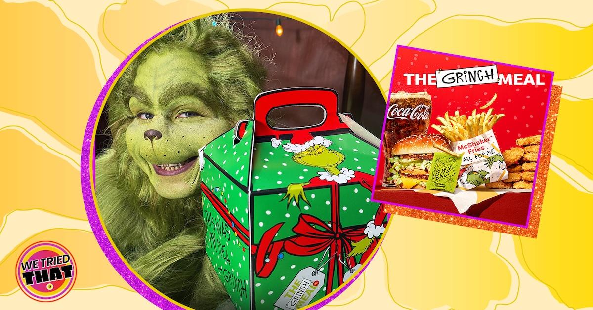
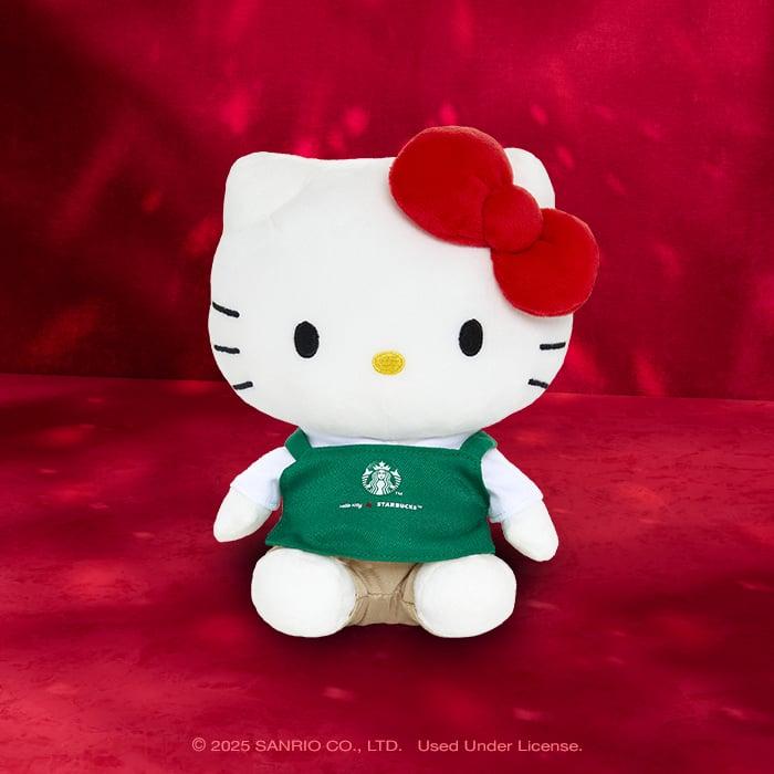
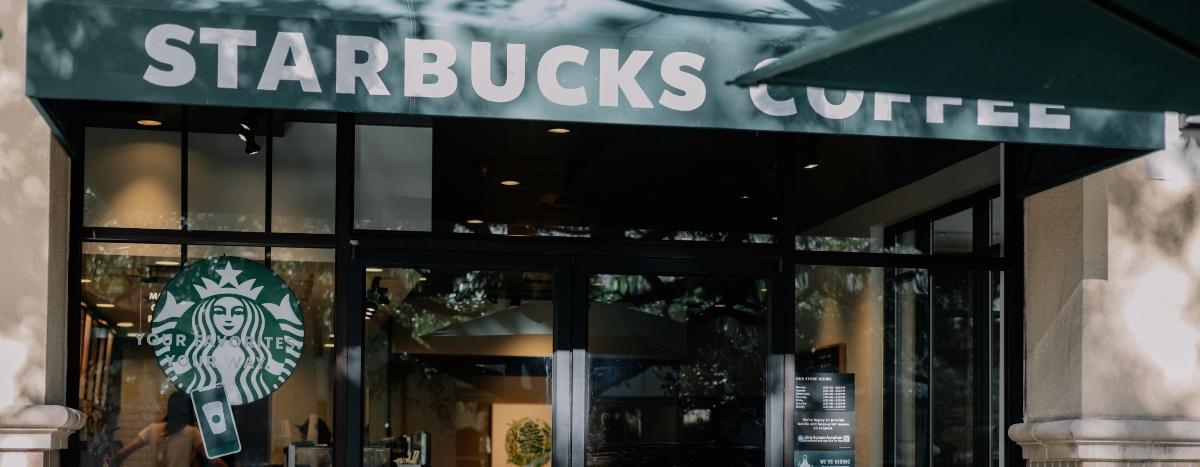
Everyone Hates Toucan Sam’s New Look (Including Us)
Is Toucan Sam’s redesign the worst thing that has happened in 2020? No. But it’s definitely *one of* the worst things that has happened in 2020.

May 20 2020, Updated 3:42 p.m. ET

In these trying times, many people are seeking comfort in things they know they can count on. And a lot of those things are food. It’s no coincidence that as soon as things started getting weird and bad, humans hightailed it into their kitchens to bake bread and other comfort foods.
For some, cereal is the ultimate comfort food. Nothing transports you back to the carefree days of youth more quickly than the sound of sweetened oat (or, these days, corn) cereal pieces ringing delicately against the walls of your favorite cereal bowl. And yet, Kellogg’s has apparently decided to take our beloved cereal-related memories and taint them forever. We’re talking, of course, about Toucan Sam’s new design.
The internet kind of hates Toucan Sam’s new design.
If you haven’t seen Toucan Sam’s new design yet, we encourage you to close down your internet and go pour yourself a bowl of cereal before reading any further. Honestly, maybe consider unplugging from the internet grid altogether. It’s all only bad news now. And sure, the bad news isn’t limited to the new designs of cereal mascots, but that is the bad news we’re ready to tackle today, OK? Anyway, this is what Toucan Sam looks like now:

We’ll give you a second to let your eyes stop burning. Pretty bad, huh? Whereas the Toucan Sam of your youth pretty closely resembled an actual toucan, this new Toucan Sam is neither 100 percent toucan nor 100 percent non-toucan. Why does he have teeth and a beak? Why is his mouth floating in the middle of his beak? Why is the beak covered in oil-slick-y rainbows? Honestly, most of our issues center around the beak.
It’s like someone who has never been a child asked themselves, “What do children like?” before plunging into a kaleidoscopic fever dream and waking up with this … this creature fully formed in their clearly diseased brain. And we’re not the only ones who think so.
The internet may tend toward unjustified anger most of the time, but in this case, we feel the vitriol is well deserved. People don’t like it when you mess around with their childhood icons, and that includes beloved cereal mascots.
This isn’t the first time Toucan Sam has gotten a new look.
We’d be remiss not to point out that Toucan Sam’s look has changed several times since he first came on the scene back in 1963. Here’s a picture of the first-ever Froot Loops box design, featuring a gray Toucan Sam with large, colorful stripes on his beak:

And his appearance wasn’t the only thing that was different about Toucan Sam version 1.0. He also spoke a lot of Pig Latin, referring to the cereal as “Oot-Fray Oops-Lay” which can you hear in this commercial from the ‘60s! Before long, Toucan Sam got a new look (and a new accent) that more closely matches the mascot you know and love.
And now? That mascot is ruined forever. Or, hey, maybe it was time for a rework of an old design and this new Toucan Sam really is what the kids want these days.
Nah, never mind. Change is bad and we are firmly on the side of the rest of the internet when it comes to Toucan Sam’s new design. Bring back our beloved bird! We wouldn’t follow that nose anywhere.